In its first refresh in over five years, Instagram introduces their new brand identity from their brand, product and creative teams. This new look aims to focus on accessibility and legibility throughout.
Instagram had three key objectives in mind during this refresh:
- Establish a distinct identity with our first custom typeface, inspired by our design foundation and designed in multiple scripts.
- Bring more vibrancy with more depth of color to our gradient, designed to feel illuminated rather than one-dimensional.
- Create a modular branding system with design applications across multiple types of channels.
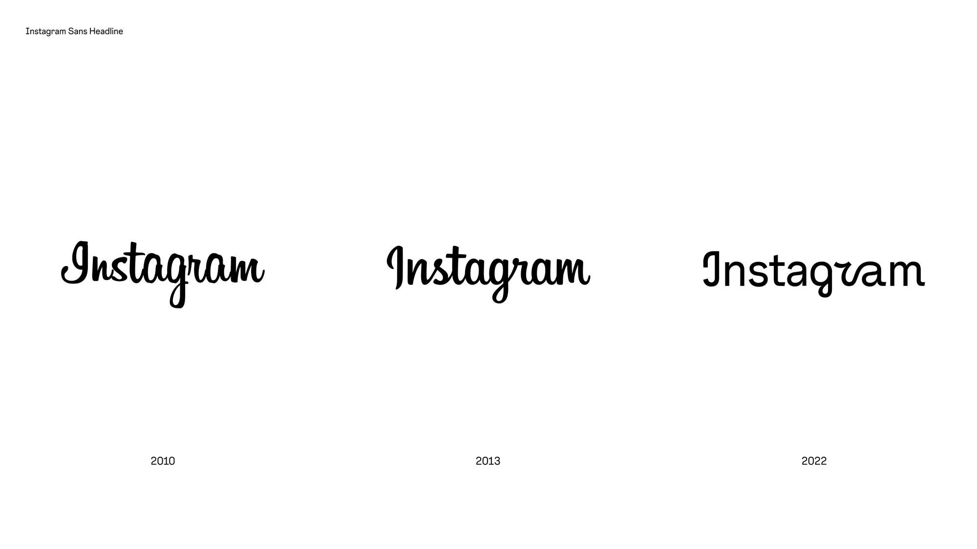
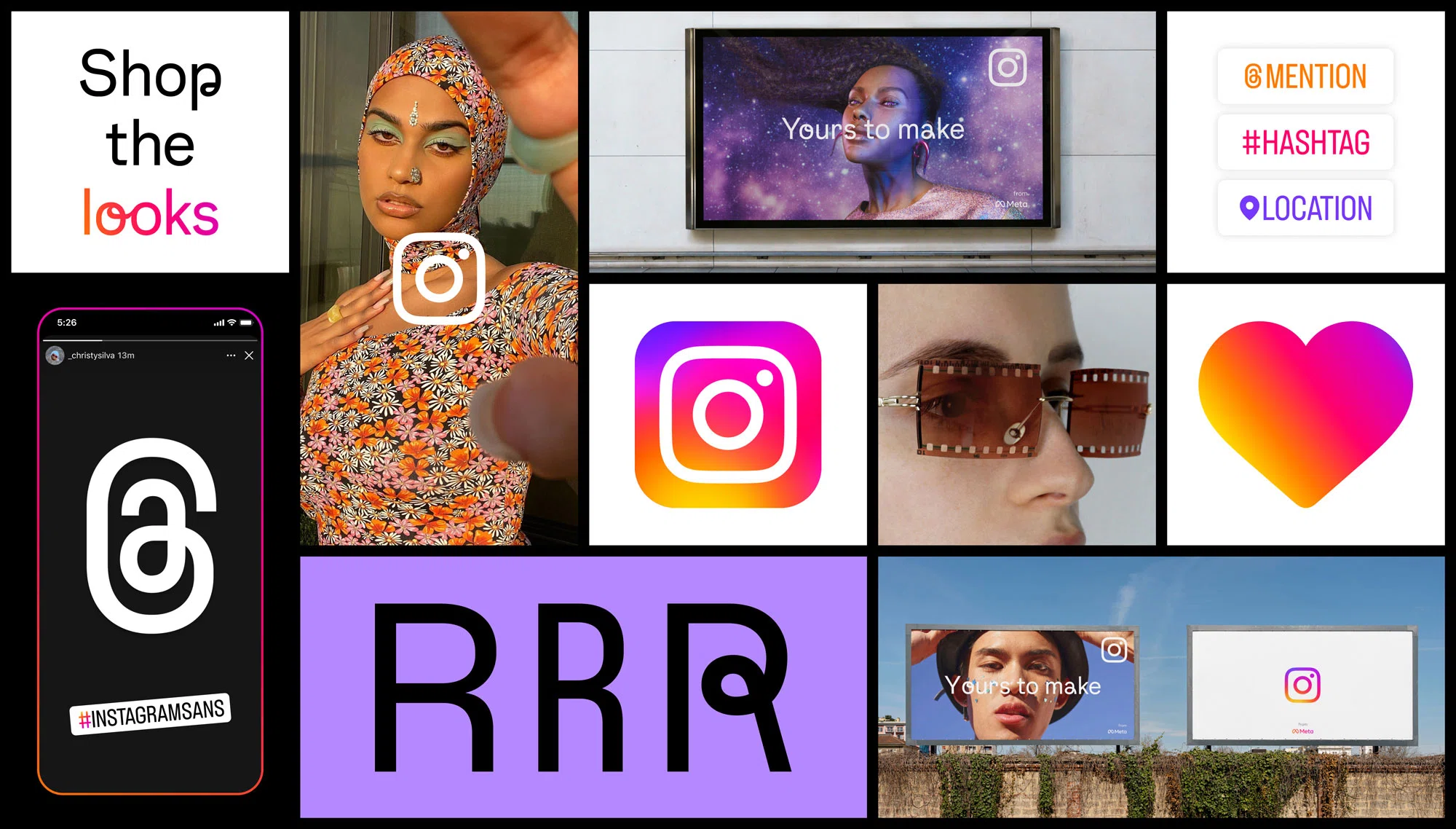
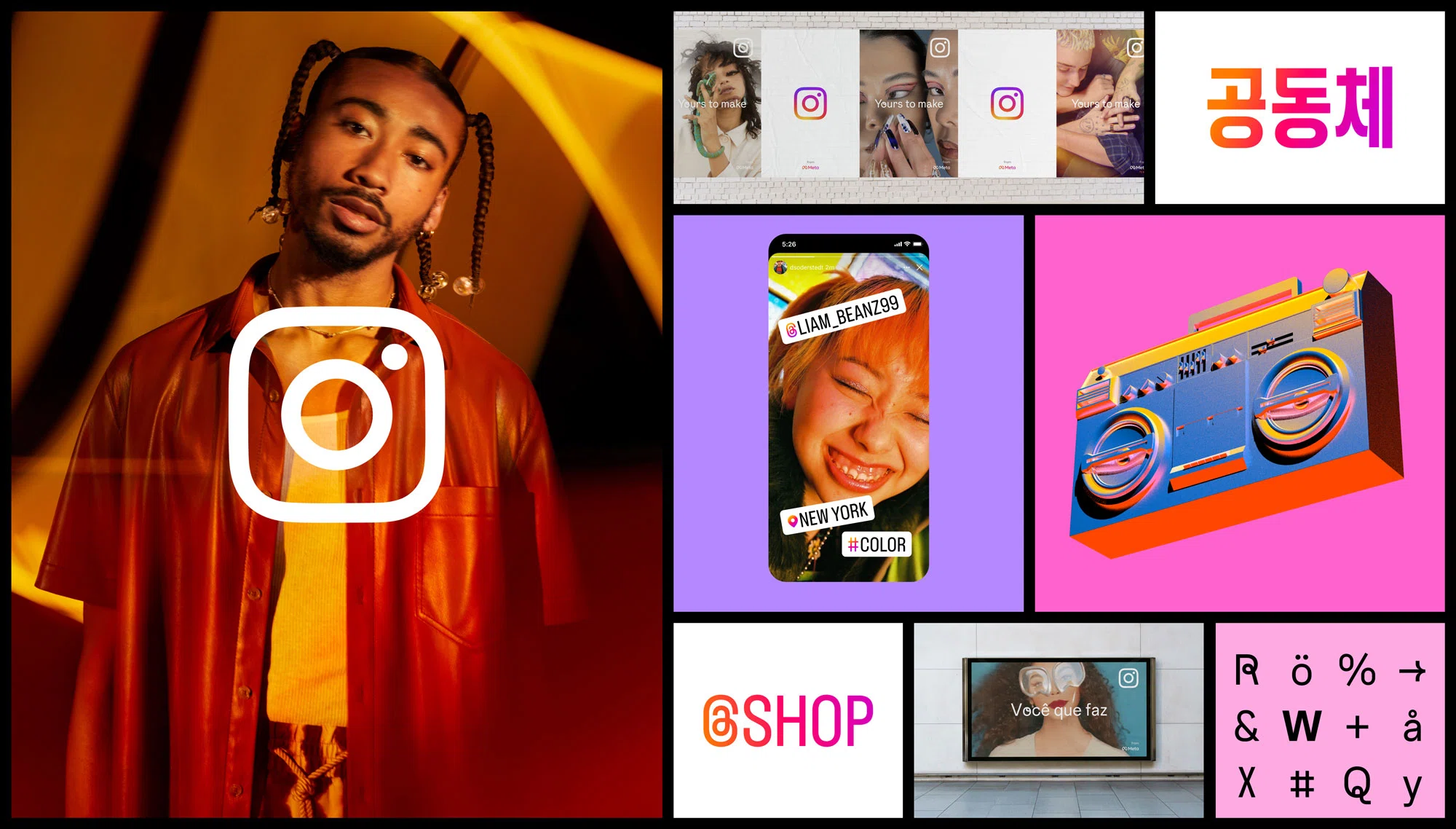
A custom typeface
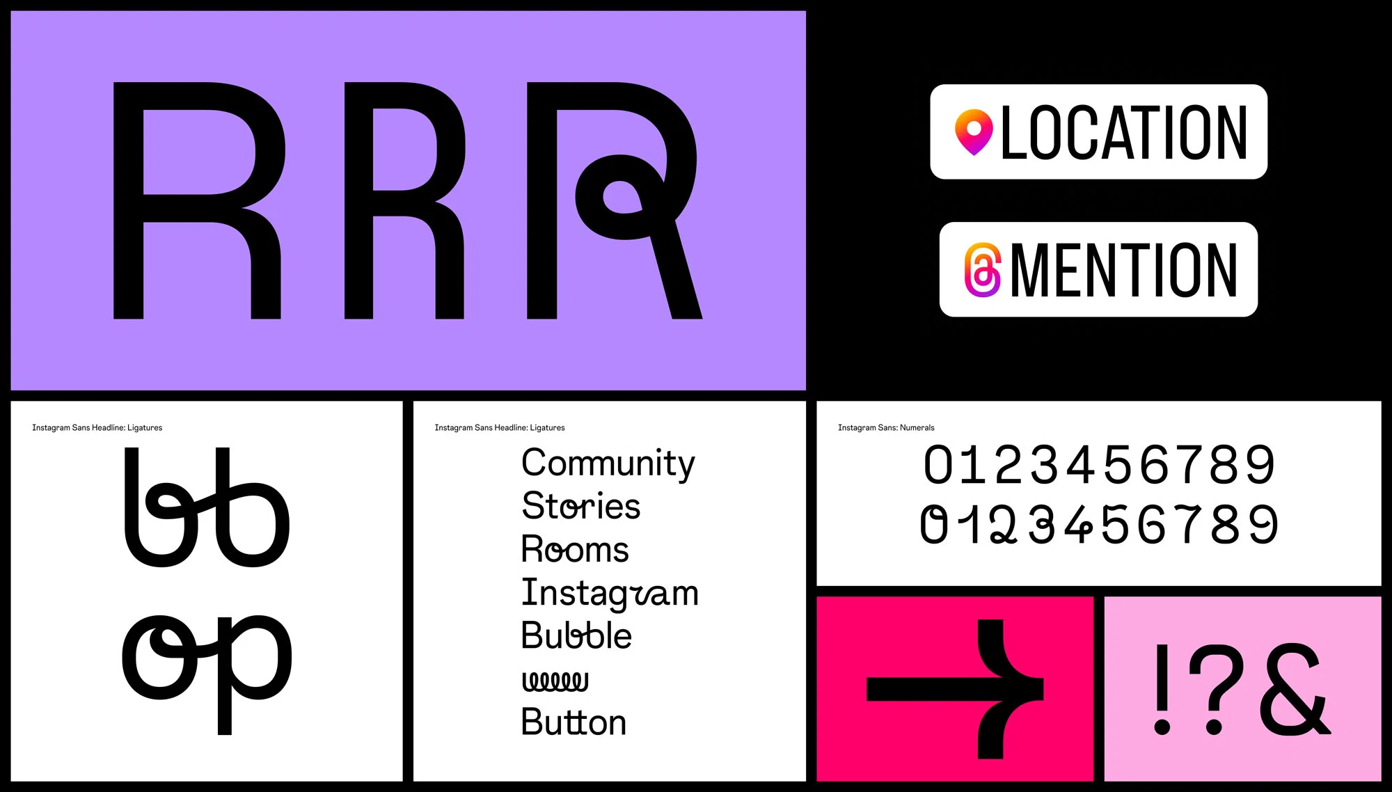
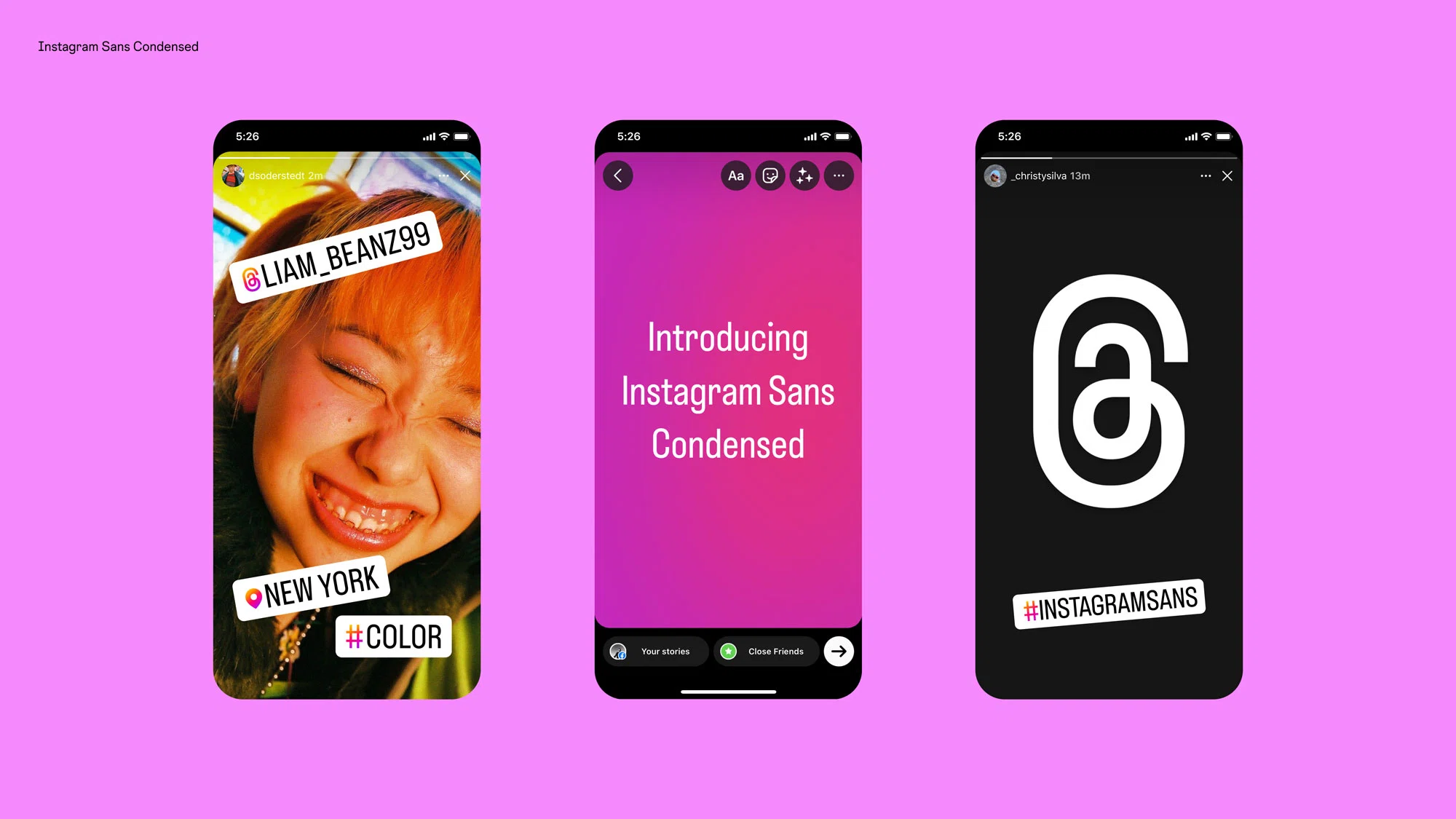
Created in collaboration with Colophon Foundry and several global type foundries, Instagram Sans is available in three styles: Regular, Headline and Condensed.
The typeface was designed to be globally accessible, with multiple global scripts.
Instagram collaborated with over 40 typographers and language experts to produce multiple global scripts. Korean, Thai and Arabic.
An illuminated gradient
This updated gradient had the goal of looking lit from within. Working with 3D digital artist and motion designer Rose Pilkington, a digital light was created to create a unique gradient everytime it is used.
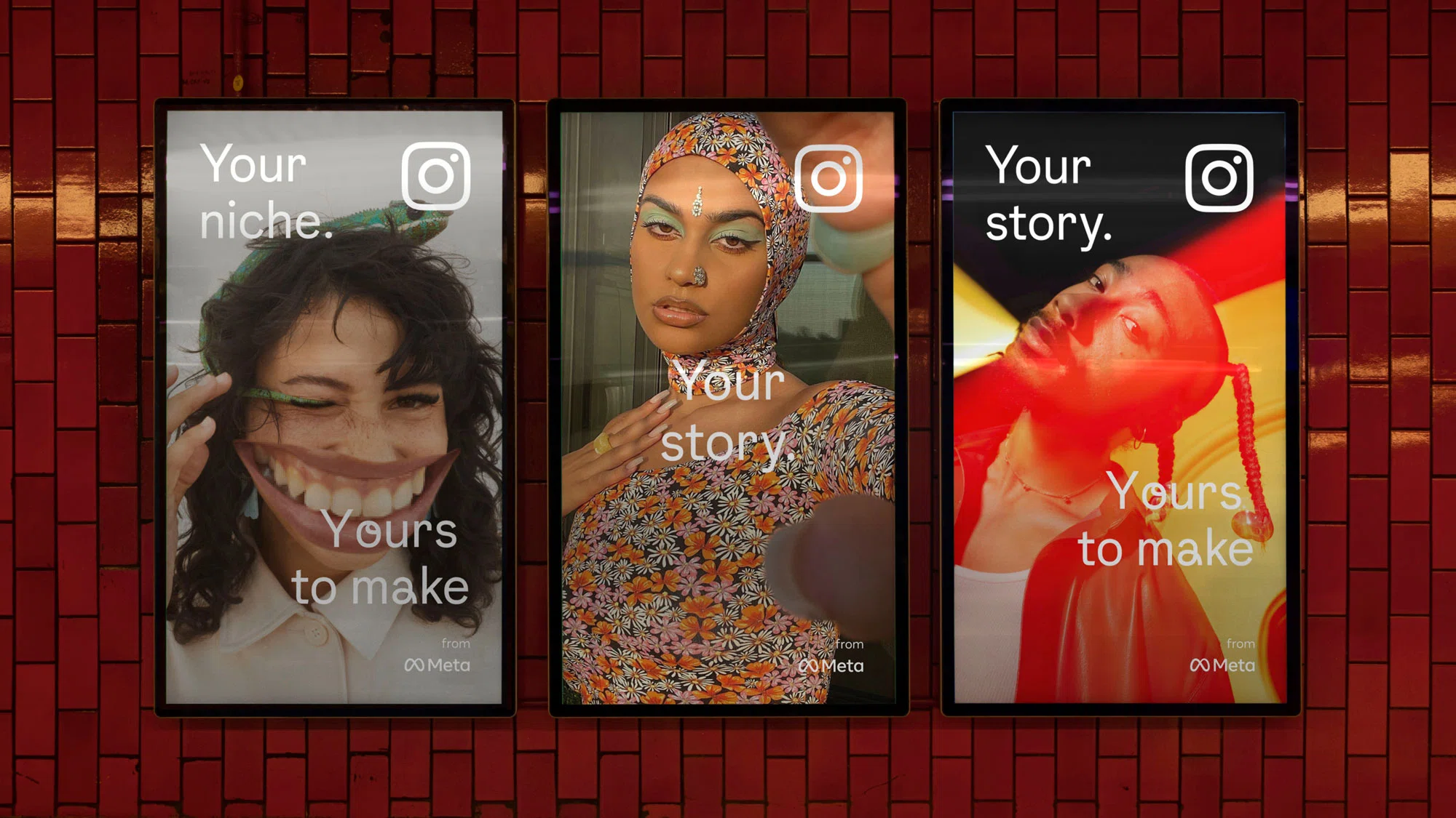
Layout
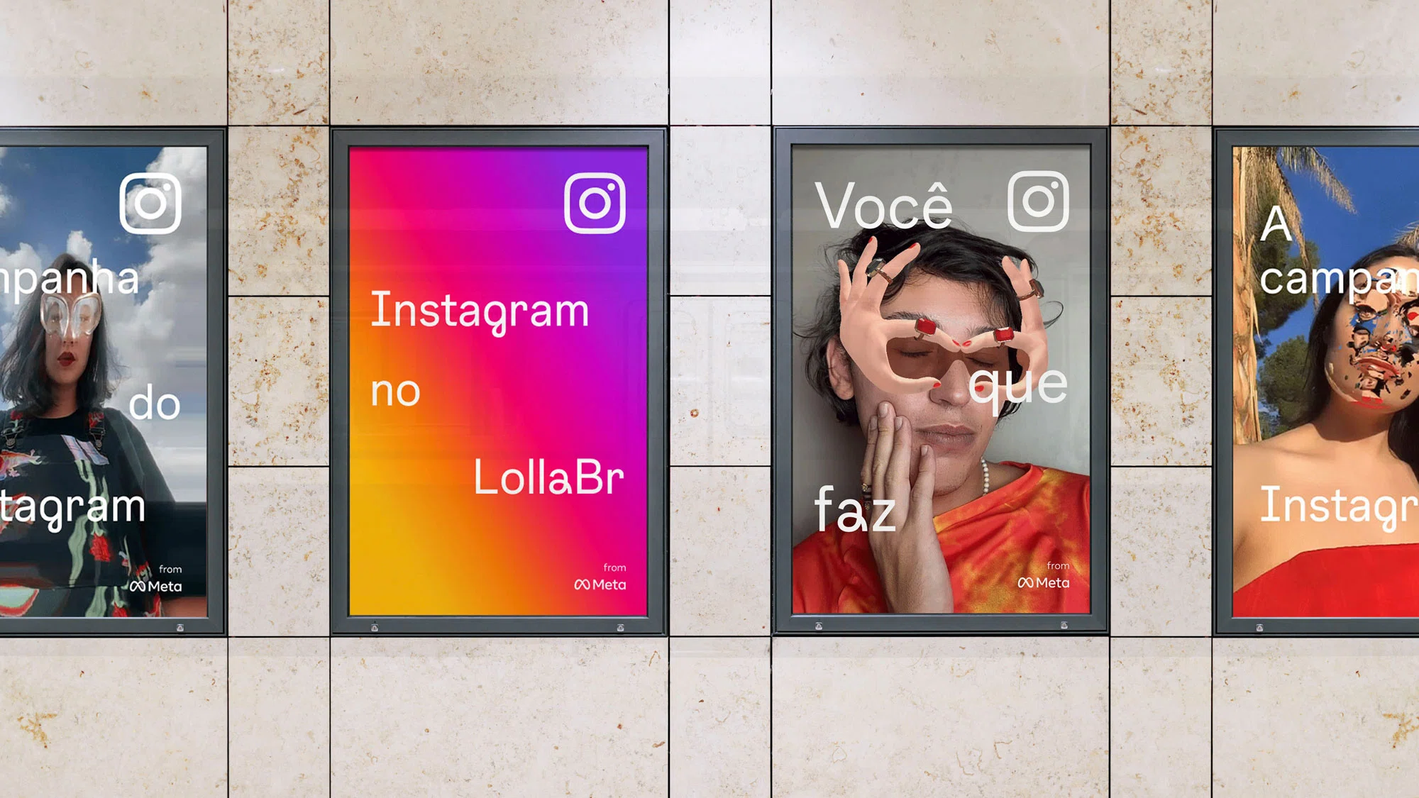
Instagram wants to put their community at the forefront by using full bleed imagery of real people.

Check out the rest of the rebrand below: