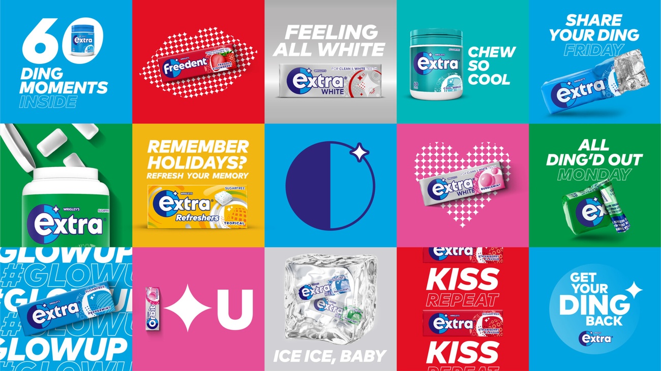
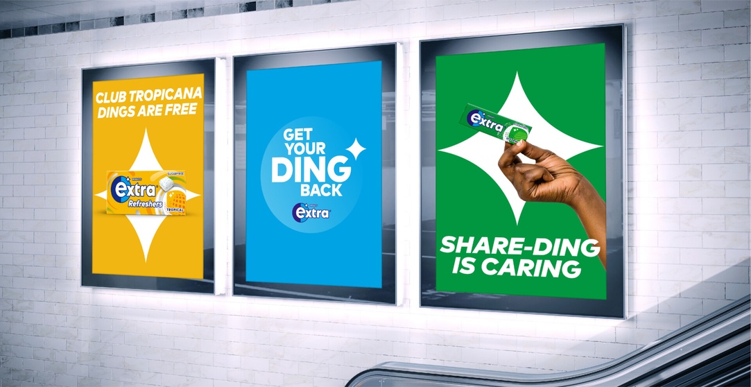
Extra Gum
A fresher look for Wrigley Gum with the help of the agency Elmwood.
The project deliverables were to appeal to a younger customer and to transform Extra Gum into an iconic, lifestyle brand for a digital-first generation.
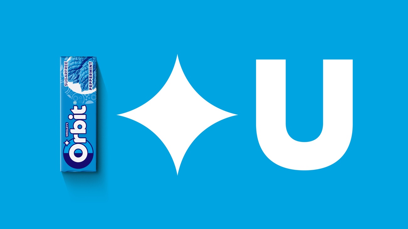
The Ding – The ding symbol alludes to cleanliness or dental hygiene. Utilising that to be bolder and eye-catching – reimagining it as a metaphor for celebrating moments of confidence.